Thursday, 20 October 2022

Some Little Details

After last week's Big Production, here are some nice photos of a more modest project from maybe ten years back. I did it for David Imrie, whose photos these are. The idea was to take some of the Hudson and Allen mediaeval buildings and work them up into three village units by painting, adding scenic bases, trees and little details. I already posted a couple of images of these village units ("A Smaller Project", December 2021, under the France label). I always thought there were some nice little touches that those images didn't show, so was pleased to find some more pictures, lurking in plain sight, on David's Facebook page from right back in 2013. And with his kind permission here they are.

The details on this unit are the row of beehives and the "cock crowing on the dungheap", as the saying goes.

A nice group of storage containers here. 

This one's all about the pigs and their trough. I built the shed, but in self-criticism mode I would say the roof is rather too shallow in pitch. Wooden shingles wouldn't keep the rain out on an almost flat roof. Those pigs wouldn't keep dry, although with such appetising and plentiful swill I expect they will get by.

A line of mediaeval washing is the feature here. 

A cat picks his way along the top of a wood pile in this photo. I'm quite pleased with the natural grouping here. The logs are just bits of twig, though I think I painted them up a little bit.

All three units combined into a village, together with a church I made.  


Saturday, 8 October 2022

French Baroque Chateau

Finished at last! I've been working on this chateau model for some three months now, and here it is. Whether it was worth all that work is up to you to judge, but I honestly don't think I've ever built anything more elaborate as a single model. 

Before you started to read this, you will no doubt have seen the new header picture of my blog. It shows Bavarian staff of the Franco-Prussian War: an officer of light cavalry reports to corps commander, general von der Tann. What's not changed is it still showing a wargames building by me, but figures mostly painted by my friend Garry. I converted the figures from 1866 ones by North Star. We work as a team on most of our wargames projects.

This was the second of three models I planned as a project. The first was the "mini chateau" posted a couple of months back, and the third will be the sort of chateau which started life as a mediaeval castle so is built of stone and has round towers. France is a country with perhaps 20,000 chateaus; no-one really knows the true number. Hundreds of the most attractive can be viewed by region on this nice site: So Châteaux (sochateaux.com) No wargamer is ever going to have more than a couple of such models, so I wanted to build something that would represent the most characteristic types. When you really boil down the enormous variety of styles it comes to those which were once castles and those built from the 17th century onwards as stately homes, mostly in the style we call baroque. That means a version of classical architecture which stresses regularity and avoids over-elaborate details, but overall aims to impress the beholder as a dignified, tasteful display of power. So here's my attempt to express this, whilst keeping to a quite small "footprint" consistent with the ground scale of my games. 

The building is made from Wills sheets for the tiles and brickwork, resin castings for the windows and other details, and a lot of individual stones cut from styrene, as described on the work-in-progress post six weeks ago. In all there are well over a thousand individual parts.

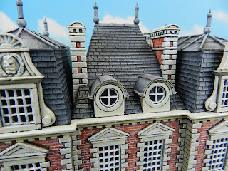
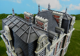
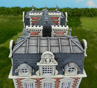
In some ways French baroque is "all about the roofs", so I went to town on getting a complex roof shape. It comprises a central hipped roof section and a separate "mansard" roof at each end. A mansard roof is the typically French style that has a near-vertical outer face, usually of slate and a more horizontal top, normally of sheet metal. 

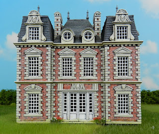
A common feature is what I call the "tricolour" scheme of contrasting reddish brick walls, off-white stonework and almost-blue (well grey really) slate roofs. I avoided anything which would disrupt that attractive colour scheme, keeping the roof finials grey rather than verdigris green for example. 


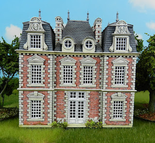
At first glance this looks like the previous picture but in fact it shows the back of the chateau, which has a different, plainer doorway.

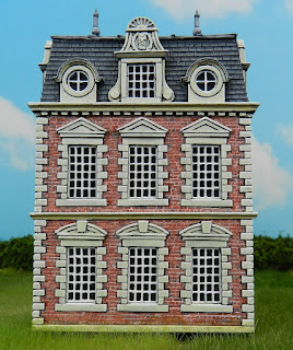
And here's the side view. There are four different window types.

Elaborate chimneys are a feature of this style of chateau. The architectural detail of each one reflects that of the building as a whole, the materials contrasting nicely with the grey of the roofs. Because nearly all photos are taken from ground level, I couldn't work out where the heck the smoke actually emerges from this kind of chimney, there being no kind of chimney pot! Eventually I found a promotional video of one chateau taken by drone and discovered they have a line of slots along the very top. 

The tops of mansard roofs are made of sheet metal: lead, bronze, or from the nineteenth century zinc, as shown here. I studied pictures of old zinc roofing and found it tends to vary a little in colour between sheets, and to be vertically streaked by rain and dirt.

The front entrance from close up. You just might have wondered who the face is supposed to be on the dormers and above the door. These architectural embellishments might show a coat of arms or a pattern, but a face is another possibility. I took the original from a plastic figure. I see him as either an illustrious ancestor of the owner or perhaps a classical hero with some supposed link to the family.

Another staff group poses in front of the chateau, this time a Bavarian divisional commander. He's a conversion from the the Perrys' figure of Prussian general Steinmetz. You do get more idea of the relatively small footprint of the model here. It's actually just 134 x 89mm.


Saturday, 1 October 2022

You Can't Have Too Many Woods

Work In Progress report: painting of the baroque chateau is only a little forward of where it had reached when I last posted, a week ago. I spent four hours painting the base colour of the stonework in what I wanted to be a beige colour. Don't let anyone, not even an online chart of equivalents between the old and new Games Workshop paint colours, tell you that the modern equivalent of "Bleached Bone" is "Ushabti Bone". It actually comes out not so much beige as the sinister yellow-grey of late WWII German tanks. So four hours wasted. After a repaint it's starting to look nice though, and we modelmakers know that our efforts only begin to look good when they are 95% complete, so not long now! Time for some other stuff...

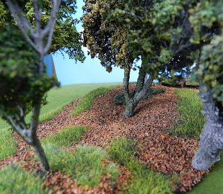
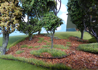
This post completes my record of the woods project I carried out in 2021. My previous approach to wargames woodlands was shown in a post "The Woods and the Trees", which you can find if you click on the Terrain label in the right-hand column. That method was to build "wood units" with a rigid base and a perimeter of bushes and small trees. That looks good and gives an impression of defending troops being under cover, but disadvantages made me rethink it. There were several issues. The wood units couldn't practically be put together to form a larger wood, never mind overlapped to give a different shape. You were stuck if you wanted a wood to go up the side of a hill, as they very often do in reality. Being about an inch thick, the perimeter of bushes formed a slightly irritating no-man's land in play terms: should you measure ranges from the edge of the wood or where a defending unit stood, a certain distance behind that? It was awkward if a unit's bases straddled the edge of the wood. And fiddlesome to reach down behind trees on the perimeter to get at a unit within. So I decided to make some perimeter-free wood bases, using the flexible felt approach.

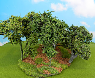
Here's the result. One big advantage is that this kind of wood base will lie flat on the board, whatever hills are underneath it. They can go on top of a hill, along the side or part on the flat, part on a hillside, as you see here. In real life, woods are situated disproportionately on hills, because the flat land is where you want to grow your crops. The tree models are a mixture of based ones and pin-fixed, as described in my last post.  The pinned ones can be placed on the very edge of the base, where they are out of the way of figure bases and usefully serve to fix the wood in place. 

If a unit of figures moves into the wood you just move any trees out of the way.It is still completely clear where the edge of the wood is in the game. A unit of figures which is partly in the wood and partly not presents no problem at all in play terms. I should have taken some photos with figures to illustrate this, shouldn't I? 

I made twenty-odd wood bases like this, of all shapes and sizes. Some only fit one or two trees, more copses than woods, which you sometimes need to create a historical battlefield. All these bases easily store in a single shallow fruit-tray, because they all quite thin in section. A useful feature when laying out a game is that the bases can easily be overlapped to get a wood of a specific shape. Because they are thin, the overlap looks acceptable. Again I should have photographed an example of this, but you can see it with the based trees on top of the woodland surface.

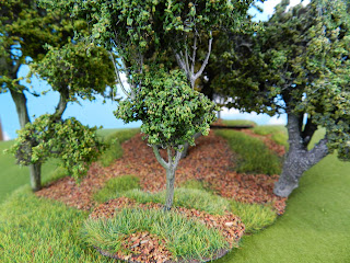
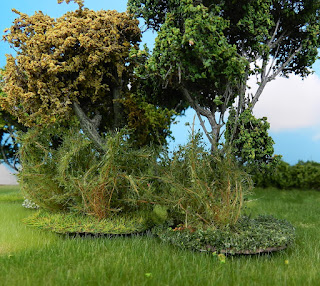
Most of the wood bases are covered in patches of grass and patches of leaf litter, which is what the interiors of woods are most commonly like. I made some of the bases with areas of weeds and/ or non-lurid flowers-see the tree bases below. The grass is fairly tall static grass, applied with my applicator. Leaf litter is a "witches' brew" of materials, stuck down with thin PVA. The main components are suitably coloured cork granules and the little leaf things you get from autumnal birch catkins, reduced in size by chopping with a rotary cutter. But the mix also includes sand, tea-leaves and chopped-up plant roots.

Lastly here's acouple of features used on some of the tree and wood bases. First come ivy, which uses foliage material from ModellNatur (left) and MIG (right). Both give a good impression from a normal distance but up close the fibrous material which supports the leaves is a little too prominent. 

These two bases are covered in bushes and foliage serving as weeds. Both are from the Czech firm Polak, who make some really nice scenic stuff, although their UK agent's website is problem-ridden at the moment, so I'm not adding it to my Links section.